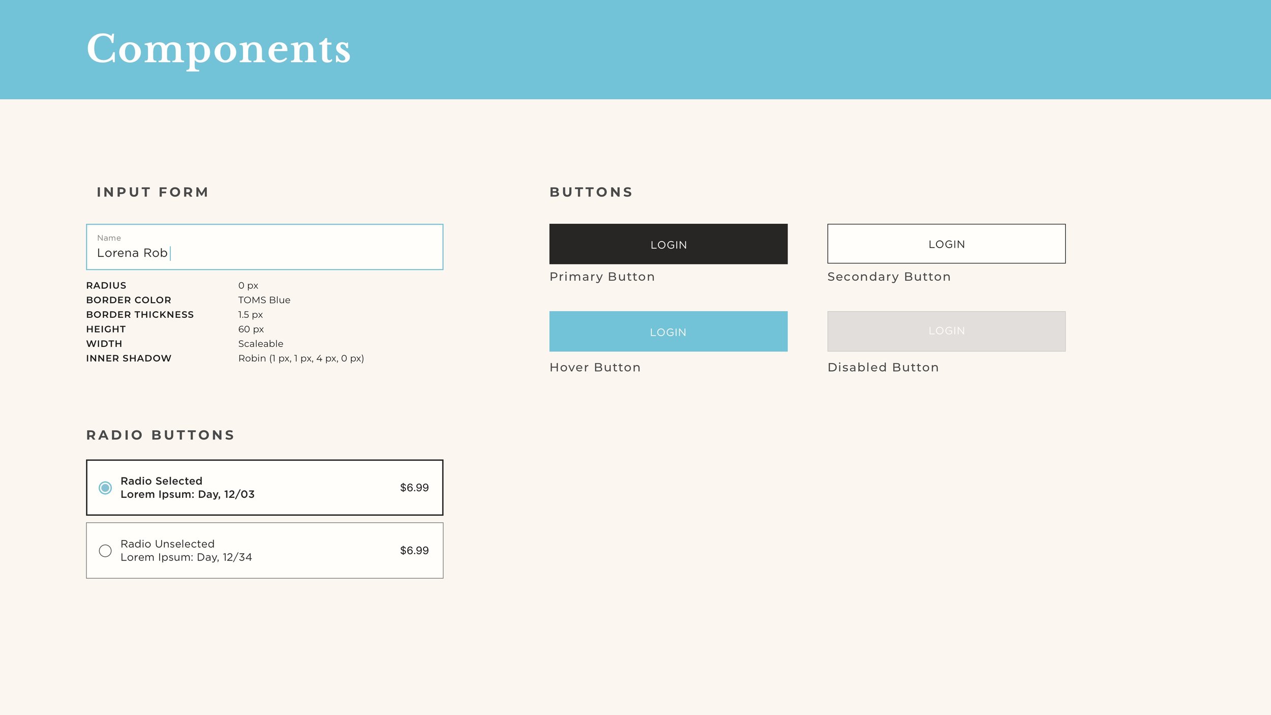
TOMS Design System
Visual Design: Catie Takimoto
Optimized TOMS digital channels from the homepage to create cohesive elements across all platforms. Following principles based on Google’s Material Design and Atomic Design, I created a design system for TOMS to implement throughout digital channels that maintains consistency across different devices from mobile to desktop.
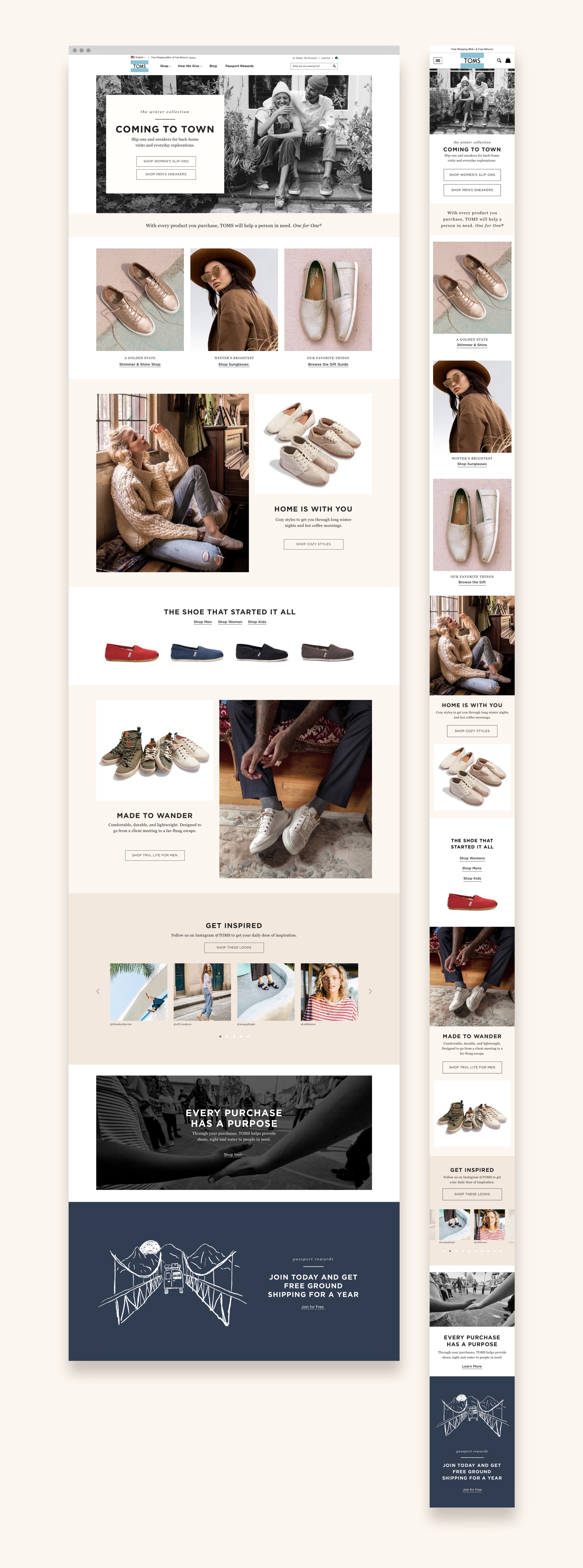
Typography, colors, and icons are the same throughout digital channels to maintain brand identity. Seasonally, colors can be added to create different moods (cool for winter, pastels for spring, etc.) and campaign collaborations will have unique art direction.